Concept Development | Branding | Packaging | Brand Style Guide | Social Media
For this project for Brand Identity, we had to develop a concept and a brand for a department store. I chose to design for a wine department store with 3 departments, a wine store, a wine accessories store, and a wine and cheese bar. I had a minimalistic approach for this project but with the colors, I experimented using a bold color. My biggest limitation here was the tight deadlines for each development as I felt that I did not have enough time to explore different options. This project includes a lot of detail and small elements in it. There is also a brand style guide that is attached at the end for this brand. The programs I used to execute this project were Adobe Illustrator, Photoshop, and Indesign.
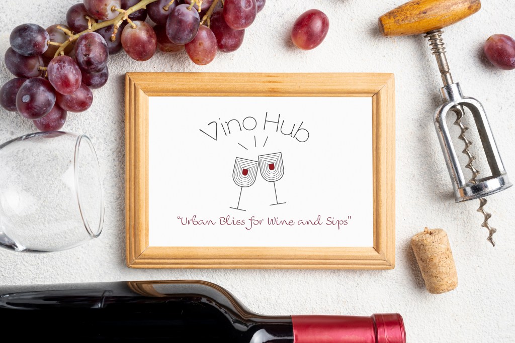
Logo
The style that I wanted to create for the circular primary logo was modern and minimalist. I selected a font that is a sans serif with a thin stroke for the name of the brand, and a cursive font also with a thin stroke for the tagline, for contrast. The logo is supposed to represent all three departments, the wine in the wine glasses signifies the wine store – where you can buy the wine from, the wine glasses – that you can purchase from the wine accessories store, and the “cheers” motion with the “clink” shown with 3 lines to represent the “Wine & Cheese Bar” where you can socialize. The repetitive design inside the wine glasses shows the minimalist touch of the design that was inspired by the minimalist art movement. The two circles around the logo represent a cross-section of a grape. Further, I created 3 logo lockups that can be used on different sizes and media. Out of the 3 lock-ups 2 were created to use with the tagline while one was without. The tagline “Urban Bliss for Wine and Sips” is to portray the convenience of a town center wine hub that offers wine tastings as well.
Icons
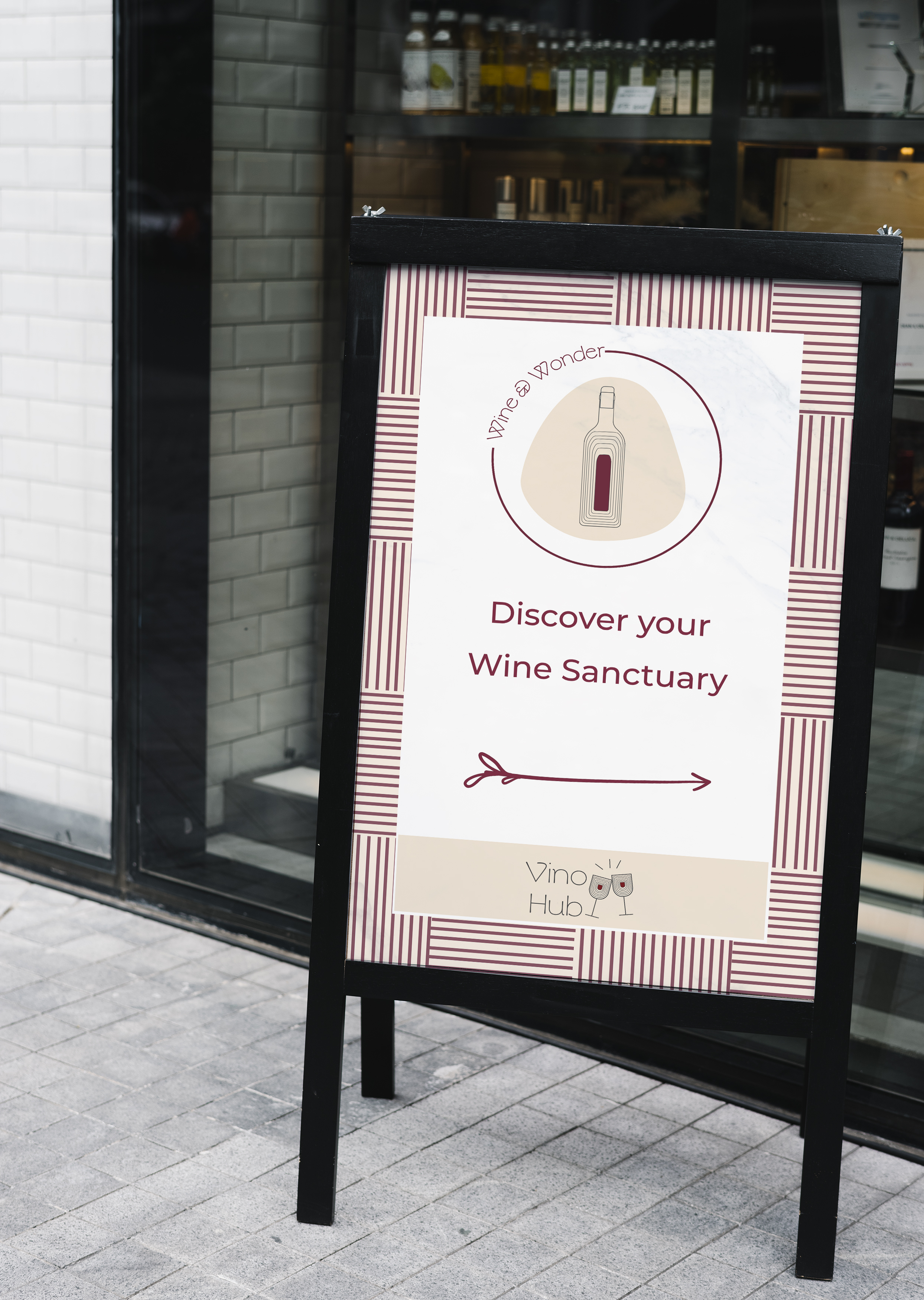

I developed 3 different Icons with concept names for the 3 departments. The icons were kept similar to the logo for consistency but there are a few elements that are different. These sandwich board designs with the icons are to be placed in front of each of these stores pointing to the entrance.
Applications


Three different applications were designed for each of the departments. They are a Wine Bottle Bag, A wooden wine gift box, and a cheese board. The patterns and design elements used for these were also created by me.
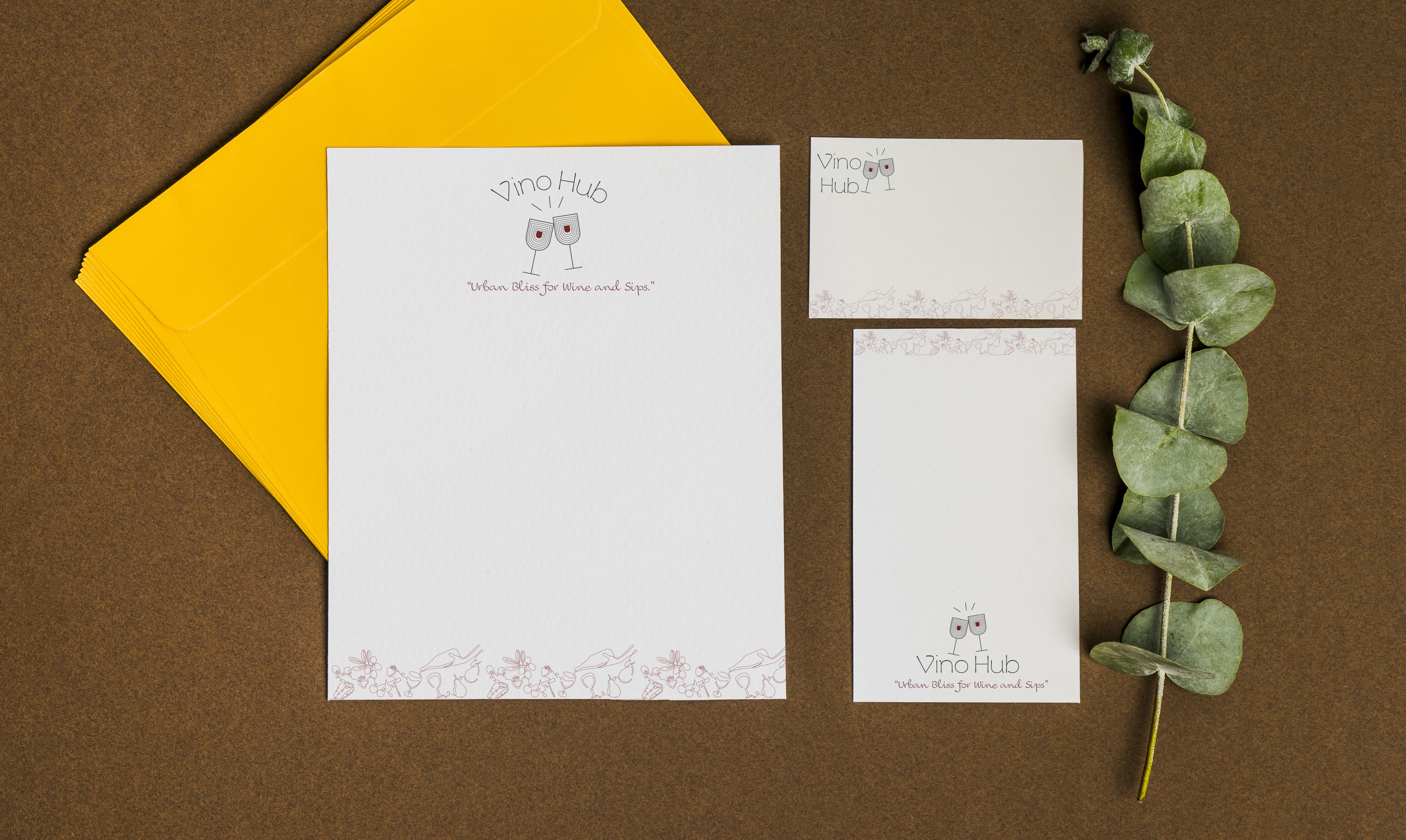
Stationery
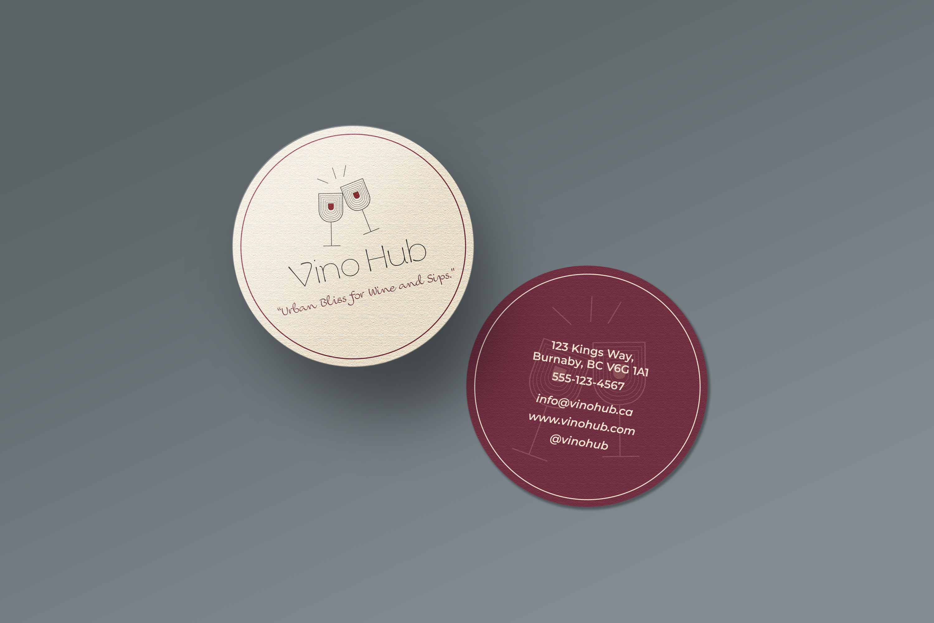


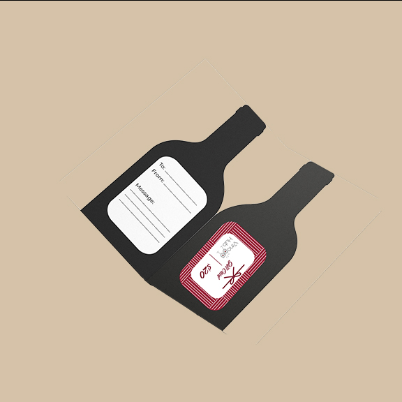
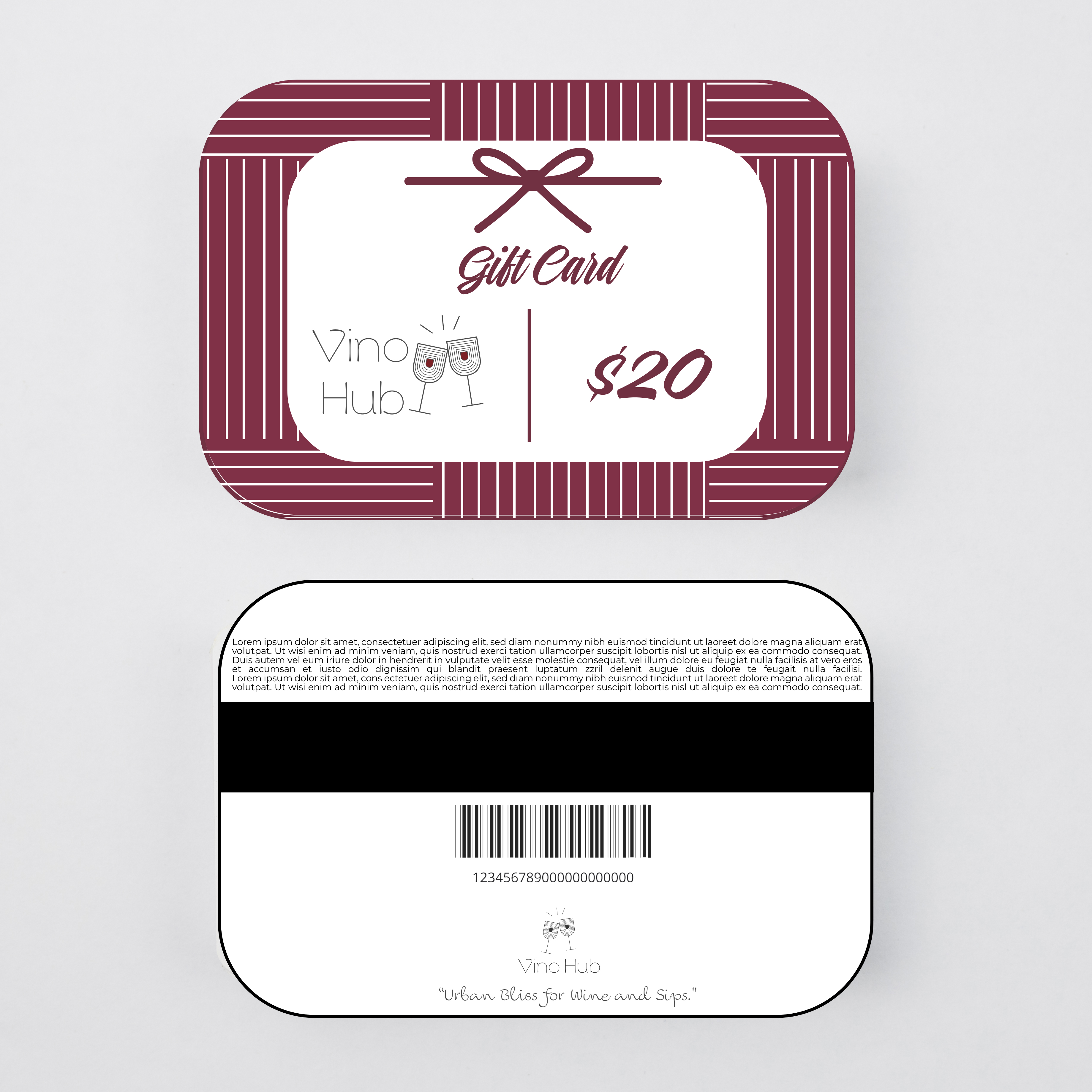

The stationery system was designed more for the main brand. It consists of a Business card that can also be used as a coaster, an invitation that resembles a cheese board with a sleeve and Gifts cards of 3 different values that comes with a gift card holder in the shape of a wine bottle.
For further insights into this brand, please refer to the attached brand style guide for comprehensive details : Vino Hub Brand Style Guide
Adobe Illustrator | Photoshop | Indesign
